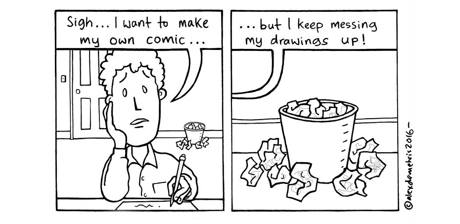
Whether you simply enjoy doodling stickmen and drawing smiley faces, or have gone further into your artistic journey to illustrating books or storyboarding animations – our tutor, Alex Demetris, has leant us six professional tips on how to draw more convincing characters.
The article is illustrated through his specialist art form and some of the ideas that we present here are addressed in his Comic and Graphic Novel class, but all of them can be transferred to any level or style of character design, from a cartoon scribble to a lifelike work of art.
1. Work out a back story to your character
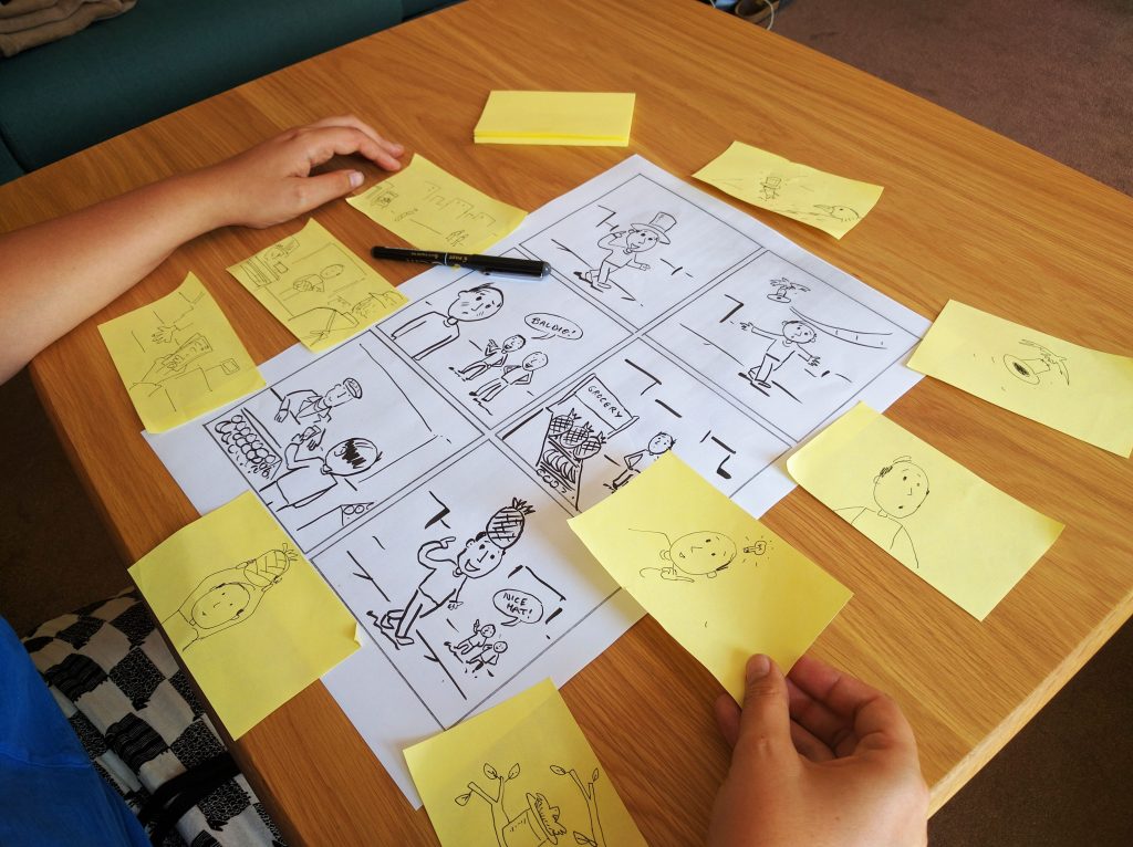 Though the ads and cartoons we see on telly can seem pretty effortless, this is deceiving to how much art – and brain – work has gone into making them.
After you have decided on your target audience, one way to bring the particularly important characters to life is to get lost in the world of your imagination and cook up a suitable backstory for each of them.
The more complex the backstories are, the more time they will take you, but the more thorough you are, the easier it will be to identify the personalities you want to portray.
This process of character design is the one of the few instances where daydreaming might be deemed a good thing!So have a good think. Create a timeline of past events that your central character would likely look back on and remember as they ‘grew older’. It could be something big or something trivial, like making daisy chains as a kid. Then follow that up by mapping out the logical paths they might take, staying consistent with their past – perhaps they now give away daisy chains to people when they’re sad? Without explicitly stating where this little quirk comes from, you’ve managed to add a sense of depth.
If at a later stage you decide to explain any idiosyncrasies, your audience will draw parallels and attach meaning to the narrative. Occasionally, but consistently, looping back to the character’s history keeps the audience engaged – everyone is always looking for that layer of real, raw humanity to connect with. So, if you can become immersed in a character’s history in your head, and can explain to yourself why they behave the way they do on paper, then you can convince your audience to care about their actions and at least temporarily, suspend disbelief.
2. Consider how the character fits into the narrative world
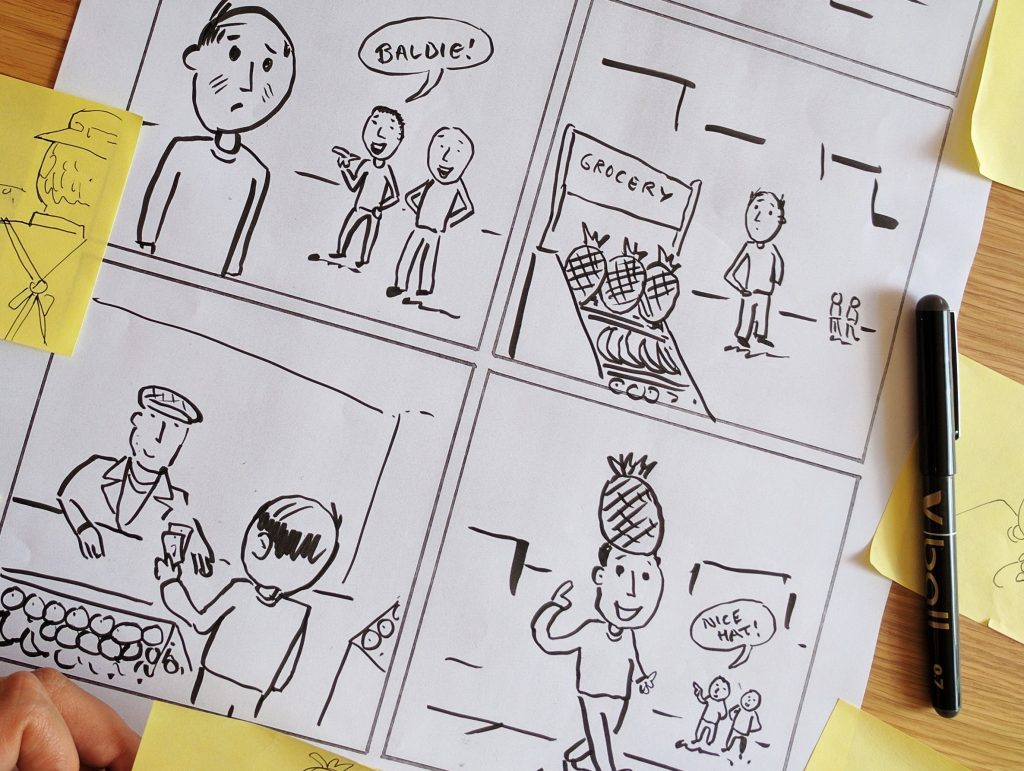 Is your character in a new world, where there are new cultures and possible even new species? Is your character in the past, where everything is black and white and wide leg trousers are all the rage? Is your character in a space age future riding a vehicle never seen before?
Pinpoint what’s unique about the narrative world you’re depicting, and reflect some of the things that are true to that time and place in your character design.
Of course you want to individualise your characters, but don’t forget that the whole point of having the story’s narrative world is to help your character manifest, bringing them to life.
It’s a hard balance to make a character stand out and simultaneously fit in, but it can be done. Start by setting limits – this helps your audience feel like they’re in a familiar place that they can safely navigate as they mentally calculate where they expect the story to go next. If you keep changing the rules, the audience will feel like they’re being led on and played around with – even cartoons need to be believable on some level. So define the attributes of the place you’re setting your story in – what is the climate, landscape, architecture, religion, and culture of your world like? What species, and types of beings, exist and how do they coexist?
Then consider the idea that the structure given to you by this process of contextualisation can increase your creativity – if you can create a prototypal world, then you can create an archetypal character. Give your character the personality of someone brought up in and confined to this world, but make them special through perhaps a power, or a tool, or smarts that no one else has. That is intelligent character design.
3. Base elements of your character design on people you know
 Take inspiration from the folks around you, to root your character design in some kind of reality.
This harks back to familiarising yourself with your character – it goes to reason that this will happen if you base them on people you’re familiar with in the real world.
Emphasis on ‘people’ – it’s definitely not a good idea to base your fictional character entirely on one person you know, because things may not remain fictional for all that long. The temptation might be to stay close to the linear of your muse’s actual life, thereby limiting the potential of your storyline. Alternately, you may not be frank enough about certain moments because you feel you’re exposing something about this person that isn’t yours to tell, once again, limiting the potential of your storyline.
All of these blocks can be subconscious so avoid that trap altogether and instead, tap into a pool of influences when designing a character. The easiest way to turn two, three or more people into one character, is to pick inspirations who have as many similarities between each other as they do differences – their mutual similarities offer a solid basis for your character’s traits, while their differences offer you choice and poetic license when it comes to making the character unique.
4. Draw consistent characters
This is where people can get re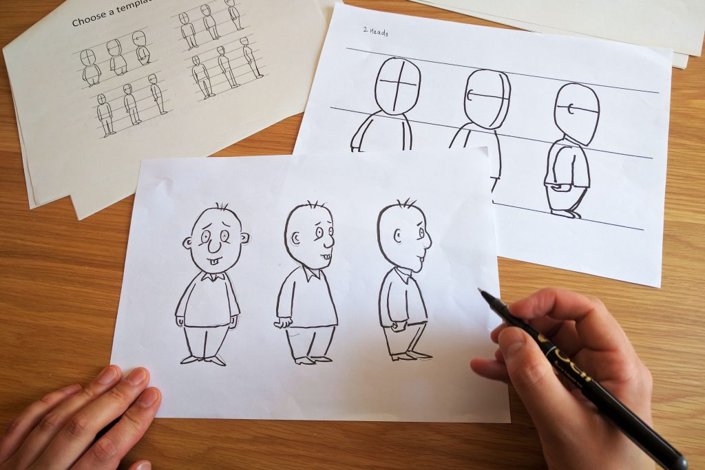 ally infuriated in the drawing process – ‘why does he / she / they look different in every frame?!’ The answer to this is equally infuriating but we’re going to say it anyway – go back to the ‘drawing board’ and spend more time on points 1, 2 and 3. To draw character-led narratives well, it is conversely very important to spend time conceptualising and writing the characters, aka, designing them.
When you eventually come to the drawing phase, you should very clearly be able to visualise in your mind’s eye, and on paper, each and every element of your character.
When you actually do get to sit down with pencil, pen or paintbrush in hand, the first thing to do is actually to work out what your character’s face and body will look like from lots of different angles – don’t worry about adding any frills or clothing accessories yet. For now, produce a template that shows him/her/them/it from all perspectives, to help ensure your character is consistent and therefore convincing, and then layer up. Refer to point 5 here.
A great little tip for when you start to draw different scenes, is to place a mirror on your desk. You can pull your own expressions and utilise the shapes your face makes to help you animate characters, making sure their expressions are consistent and logical, and that their physical features don’t contort into the impossible or to the point of being unrecognisable.
5. Reflect your character in its design
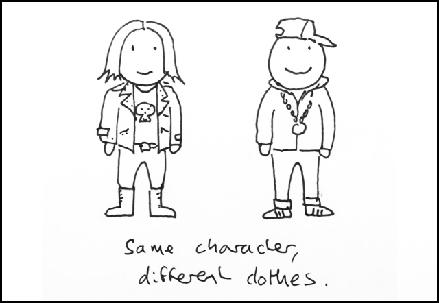
Think about what visual and psychological tricks you could use to keep your character consistent through the elements of facial features, dress sense, and proportions.
While there are lots of representations that resonate globally, there are some depictions where reactions are likely to differ, informed by an individual’s upbringing, location, or the people and the situations they’ve encountered in their life.
Different cultures and communities tend to stereotype physical elements differently, and associate them with certain personality based characteristics e.g. is a cartoon character that wears spectacles, has long arms and a head of fuzzy hair geeky to you? It may not be to your target reader, it may even be sexy – so remember to keep your audience range in mind.
Both physiognomy, and especially clothing, can help to signify a character’s job (they might wear a uniform), interests (they might dress in a hip hop or heavy metal style), or age.
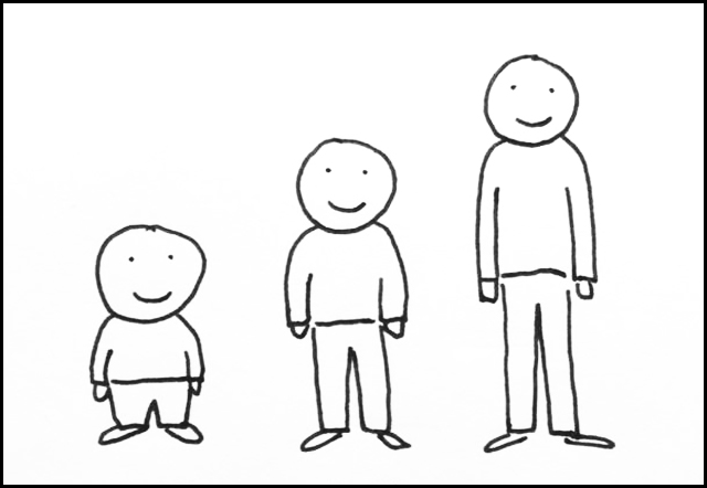
Generally, in regards to proportions when drawing, smaller characters with larger heads will often look cute, cartoony or childlike, while superheroes are typically drawn in slightly exaggerated human proportions so they tower in height and give off a strong aura of power. In between, you have characters that are a mixture of the two – cartoony yet human.
From a technical perspective, it is harder to depict characters with smaller proportions as carrying out the extreme physical activities that superheroes would, so the design of the character will need to reflect what the character is going to be doing.
6. Think about how your character might speak
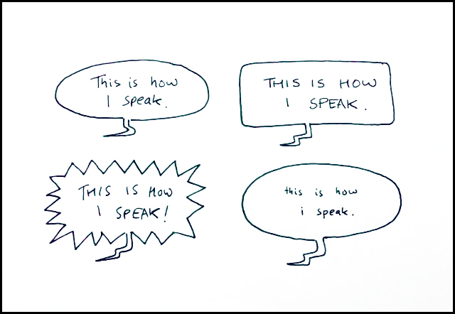 This bit of character design is about how you denote personality through a character’s choice of words. It’s also about the way you can visually depict those words.
So, what are the language mechanisms that help to distinguish characters through speech? You could look at writing in a phonetic way to demonstrate a foreign accent or regional slang, if a character’s area of origin is an important factor. You can also narrow or widen their vocabulary depending on their age, type of work or how intelligent they are meant to come across.
When it comes to drawing and designing words, you could also use things like font to indicate the way a character speaks.
For example, an ornate font might make a character look genteel or precious, while I more blocky font or capital letters can make it seem like they are loud or boisterous. Some people also use different coloured speech bubbles to convey character, and a really good way of indicating speech types is actually to alter the shape of a speech bubble. For example, here, the one with very small lettering looks like quiet speech, while the spiky bubble makes it feel as if the character is shouting.
These topics are largely covered in Alex’s Drawing For Comics and Graphic Novels class, to find out more or join, see here >>
For more creative courses, with everything from collages to speed drawing, check out City Academy’s art page >>


